一些css技术点的总结
2020-02-17
为了让自己做的页面不那么难看,最近学了点 css。
一些重要的知识点与技巧汇总如下:
1、location属性:fixed、absolute、relative
- position:absolute 脱离原来位置进行定位;相对于最近的有定位的父级进行定位,没有最近,相对于文档进行定位
- position:relative 保留原来位置;相对于原来的位置进行定位。一般用 relative 作为参照物;用 absolute 进行定位
- position:fixed 显示在浏览器屏幕的固定位置
- 单行文本垂直居中的实现方法:文本高度 line-height 等于容器高度 height、使用 padding
2、基础点
- px:像素,相对单位,pixel 的缩写,垂直屏幕方向最小的点
- font-size 指的是字体的高
- 1em = 1 * font-size,可用于解决动态缩进和居中
3、盒子模型
- 盒子模型的四大组成部分:外边距(marging)、盒子壁(border)、内边距(padding)、盒子内容(width * height)
4、颜色
- 颜色属性的表示:颜色英文名称、颜色代码、颜色函数。光学三原色:红绿蓝 rgb、美术三原色:红黄蓝。
5、html 引入 css
- html 引入样式的方式:行间样式、页级样式、外部 css 样式
6、css 选择器与权重
- css 选择器种类:id 选择器、class 选择器、标签选择器、通配符选择器、属性选择器、伪类选择器、伪元素选择器
- css 属性作用的优先级:!important > 行间样式 > id选择器 > class选择器 | 属性选择器 | 伪类选择器 > 标签选择器 > 通配符选择器
- css 权重:!important(Infinity)、行间样式(1000)、id选择器(100)、class | 属性 | 伪类选择器(10)、标签 | 伪元素选择器(1)、通配符选择器(0),括号内的数值是 256 进制数,选择器的组合的优先级计算,依赖于选择器的权重累加值的大小
- css 组合选择器:派生选择器( div span{} )、直接子元素选择器( div > span {} )、并列选择器( div.demo {} )、分组选择器( div,span {} )、伪类选择器( a:hover {} )
7、display 属性特性
- 行级元素 | 内联元素:display:inline,内容决定所占位置,不可以通过 css 改变宽高。如标签 span、a、strong、em、del、input
- 块级元素:display:block,独占一行,可以通过 css 改变宽高。如标签 div、p、ul、li、ol、form、address
- 行级块元素:display:inline-block,内容决定大小,可以通过 css 改变宽高,未独占一行。如标签 img
- 凡是带有 inline 属性的元素都有文字特性,会被分割符号(如空格、回车等)分割
8、浮动模型
- float:left/right,浮动元素产生了浮动流,块级元素看不到他们,产生了 bfc 的元素和文本类属性(inline-block)的元素以及文本都能看到浮动元素
- 父级包住浮动元素的处理办法:子元素加块级元素 clear 清除浮动流;父级的伪元素 after 变块级元素,clear 浮动流
- clear 必须作用于块级元素
- 伪元素天生是行级元素
- 设置 position:absolute、float:left/right,把元素转换为 inline-block
- float 早期是为了解决文字环绕图片问题而产生
9、主流浏览器
- 浏览器是由 shell 和 内核 组成。主流浏览器包括:IE(Trident)、Firefox(Geoko)、Chrome(Webkit/Blink)、Safari(Webkit)、Opera(Presto)
10、margin 塌陷、margin 合并问题
- magin 塌陷问题:父子嵌套的元素,垂直方向的 magin,会取最大的值,作用于父元素
- margin 塌陷问题解决方法:加 border-top、使用 bfc(block format context) 解决
- 如何触发 bfc:position:absolute、display:inline-block、float:left/right、overflow:hidden
- margin 合并问题:垂直方向两个相邻元素的 margin-bottom 和 margin-top 重叠,显示效果以大的为准
- margin 合并问题的解决办法:加一个 wrapper 元素、通过计算 margin 值达到希望的显示效果
实践:
- 两栏布局
<!DOCTYPE html>
<html>
<head>
	<title>test-2col</title>
	<meta charset="utf-8">
	<style type="text/css">
		* {
			margin: 0;
			padding: 0;
		}
		.right {
			position: absolute;
			right: 0;
			width: 100px;
			height: 100px;
			background-color: black;
			opacity: 0.5;
		}
		.left {
			height: 100px;
			background-color: green;
			margin-right: 100px;
		}
	</style>
</head>
<body>
	<div class="right"></div>
	<div class="left"></div>
</body>
</html>

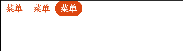
- 菜单栏
<!DOCTYPE html>
<html>
<head>
	<title>test-nav</title>
	<meta charset="utf-8">
	<style type="text/css">
		* {
			margin: 0;
			padding: 0;
		}
		.nav {
			list-style: none;
		}
		.nav::after {
			content: "";
			display: block;
			clear: both;
		}
		.nav .nav-item {
			float: left;
		}
		.nav .nav-item a {
			display: inline-block;
			text-decoration: none;
			color: #f40;
			font-weight: bold;
			height: 30px;
			line-height: 30px;
			padding: 0 10px;
			border-radius: 15px;
		}
		.nav .nav-item a:hover {
			color: #fff;
			background-color: #f40;
		}
	</style>
</head>
<body>
	<div class="nav">
		<div class="nav-item">
			<a href="#">菜单</a>
		</div>
		<div class="nav-item">
			<a href="#">菜单</a>
		</div>
		<div class="nav-item">
			<a href="#">菜单</a>
		</div>
	</div>
</body>
</html>
- 五环,固定显示在屏幕正中间
<!DOCTYPE html>
<html>
<head>
	<title>5circle</title>
	<meta charset="utf-8">
	<style type="text/css">
		* {
			margin: 0;
			padding: 0;
		}
		.wrapper {
			height: 186px;
			width: 380px;
			position: fixed;
			left: 50%;
			top: 50%;
			margin-top: -93px;
			margin-left: -190px;
		}
		.c {
			width: 100px;
			height:100px;
			border-style: solid;
			border-width: 10px;
			border-radius: 50%;
			position: absolute;
		}
		.c1 {
			border-color: red;
		}
		.c2 {
			border-color: green;
			margin-left: 130px;
		}
		.c3 {
			border-color: yellow;
			margin-left: 260px;
		}
		.c4 {
			border-color: blue;
			margin-left: 65px;
			margin-top: 65px;
		}
		.c5 {
			border-color: orange;
			margin-left: 195px;
			margin-top: 65px;
		}
	</style>
</head>
<body>
	<div class="wrapper">
		<div class="c c1"></div>
		<div class="c c2"></div>
		<div class="c c3"></div>
		<div class="c c4"></div>
		<div class="c c5"></div>
	</div>
</body>
</html>

再写这三个实例,感觉还是很好的。